
Design Projects.
Freelance projects working solo on all elements of the design process focussing on Creative Design, Art Direction and Branding,
Digital design. Web design and social media design. Including design concepts and visual direction.
Product design. Designing new products for a brand or business as well as packaging design to tie in with existing brands.
Photography. Full professional photography service for social and web assets, including styling and art direction.
Logo and Brand design. Full design process to for a new brand or rebrand, including a multi channel functioning logo and full design kit across all channels.
Interior design and stying. Making sure that any physical spaces keep inline with design guidelines and best represent the brand.
Print design. All assets in print from printed products, to packaging and promotional materials.
Art Direction and Idea Conception. Developing ideas for all aspects of the design process, for web, email, social media, print projects and events.
Brand management and Strategy. Brand Strategy and business development for start-up design projects.
Flex Pilates.
Pilates Studio Branding and brand development.
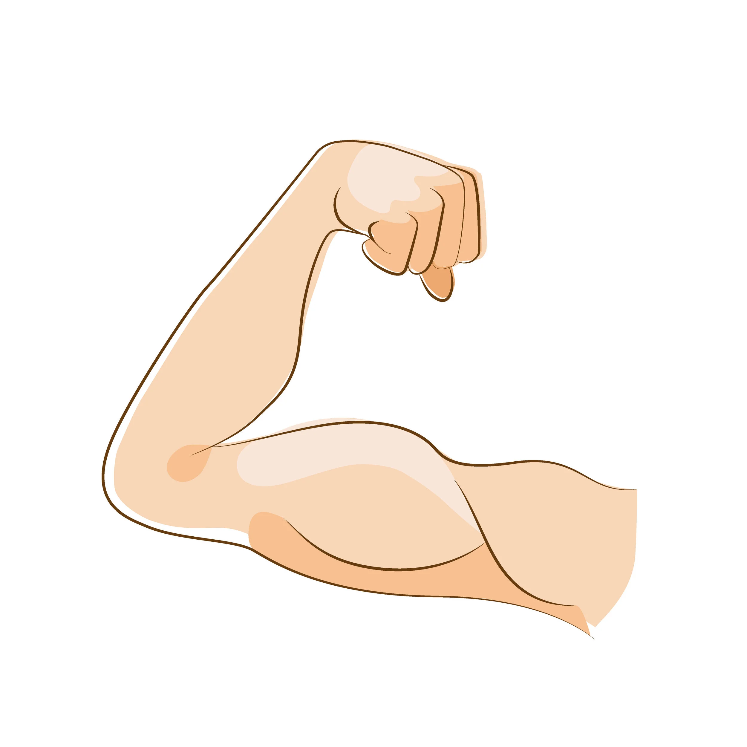
Commission by Flex Pilates, a new pilates business based in Cheltenham, Gloucestershire, to design all their branding and new facility. The centre will be focused on Pilates training for mainly sporting professionals and rehabilitation.
We worked with the brand to produce their full website including all photography, logo, business cards, flyers and posters for advertisement initially, before moving on to, a bespoke Pilates roll mat design, promotional tote bags, posters for the interior design, brand photography and interior styling for their new premises.
“Move, Breathe, Stretch, Flex.”
Marketing Leaflet for the new Flex Pilates Studio, Chipping Campden, UK


The Brief.
Create a design that was recognisable and professional, appealing to the range of people that undertake pilates training, as not to alienate any of the clients.
The Answer.
Taking inspiration from design for medical use, for the colours and clean hygienic look made the design look professional and sleek, and also created a calming space, hi-lighting the positive medical effects of the practice of pilates. In addition to this the san-serif custom logo font and the slogan “Move, Stretch, Breathe, Flex” as well as the quirky poster design also adds a fun and personable element to the studio as to encourage the clients and allow them to feel comfortable and encouraged in the space.
Developing a Brand logo, style and colours. This needed to be able to translate across a variety of uses both for print and digital.


Developing a series of posters for the studio marketing and the studio itself. Informative and fun to appeal to a varied audience in age and what the client would like to achieve from pilates sessions.


The Shape Studio.
Branding design, Product Design, Art Direction, Photography, and Brand Management.
The Shape Studio is my own brand selling product ranges in Apparel, Homeware, Prints and Painting. I design and produce all aspects of the business including working with suppliers to produce the products, managing the marketing and social media, website build and maintenance, all photography and styling, sales and of course coming with new designs and producing the products.
The Brief.
Launch a fun brand in which to sell products and try out different ideas and adaptations of my artistic style.
The Answer.
Building a website and social media to showcase the designs and ideas, to have a platform to try out ideas and creations, to have a studio set up in which to make paintings and pattern designs, and a format in which to market myself in exhibitions in which I show in as well as sharing this with others in a way they can also enjoy the products and patterns.


Another Note.
Branding and artwork creation for a new Music and Entertainment Company Another Note.
Brief
Another note wanted designs for the front of their latest editorial magazine and accompanying Vinyl for Spring 2019. The design needed to be bold and eye-catching to stand out against other magazines on the shelf and shout about music but in a sophisticated and subtle way.
Answer
I designed a bespoke print featuring abstract musical notes as the concept. These were hand-drawn using pro-create to give them a loose inky slightly abstract look that is still recognisable as music. The text layout and other colours have then been kept a simple monochrome to enhance the design but also clearly advertise the magazine and vinyl.
This design was then translated across to the vinyl album as to create a bold collectors item for the fans of the magazine. As well as being a strong visual in the monochrome look.


Original digital Ink sketch for the background pattern.
Yinka Ilori.
Yinka Ilori Brand Packaging design.
Concept design for designer Yinka Ilori’s new homeware packaging.
Development of icon design and packaging mock-up’s in the style of unique British pattern designer Yinka Ilori. These designs were made as the first part of a range of design packaging being developed for the designer, each involving a simple icon design printed on eco-friendly cardboard packaging. This example is based the ceramic mug design.

The Brief.
Create some simple packaging solutions to showcase the new homeware products from artist Yinka Ilori.
The Answer.
Simple boxes that give a design precedence to the products inside them, the icon’s on the front of the boxes clearly show the product that is inside them for their effectiveness whist showcased in a store environment, whist the unwrapping of the box would be in contrast to the brightly coloured product inside showcasing them as they are opened.


The WE ARE Community
Branding for body confidence community facebook group
Working with body confidence artist Lydia Reeves to create branding for her new inclusive facebook support group for people to talk about body issues, vulva issues, boob issues etc, and to get each others advice and support.

The Brief.
Branding creation, including logo that can potentially be used in the future development.
The Answer.
Creation of a branding colour scheme and logo that fits the target market of the community, using colours red and pink to re-associate the feminine colour of pink with more positive genderless powerful associations.
Creation of an animated GIF to put focus on the key motivations of the brand and empower the followers, as to the WE ARE community message.
“Welcome to WE ARE. An open platform for womxn, as well as gender nonconforming and trans communities. A safe space to discuss all things bodies, confidence, sex, vulvas, as well as any topic society may not yet deem as ‘acceptable’.”


Previous concept designs for the We Are Community campaign, developing concepts for future use as print assets.


Developing a range of hand-drawn digital alternative emoji illustrations for Lydia Reeves’s “We Are community” body positivity and inclusivity movement and community.


Boodles Content Creation.
Boodles social media content creation pitch and print design for a new social media style to reach out to a younger audience.

The Past and the Future
Boodles is a privately held British luxury jeweller and jewellery designer group founded in 1798, so it was important to keep true to the design of the past as well as pushing the imagery in to a new era.
The Brief.
Art Direction, Photography and Concept creation for Boodles Social Media pitch.
Answer.
The creation of the Everywhere collection, based on the concept that their jewellery is so tempting that you will never want to take it off. Full professional studio shoot, planned, styled and shot by myself. Designs for social media and also for a printed flyer.


Mum Chum Designs.
Greetings Card Company Branding and Brand development
Mum Chum is a greetings card and gift design company founded in 2020 by Liz Kirkham. Based in the Cotswolds, this small but perfectly formed company aims to provide you with a joyous way to celebrate any event or occasion for all the family or even just to send someone a little something to brighten their day.
We have developed a range of cards and gifts with Mum Chum to best showcase her unique illustrative style, as well as providing a full start-up branding service from logo and full website to promotional postcards and stickers as well as building social media channels.

The Brief.
Launch a fun new greetings card and gift brand selling quirky illustrated luxury cards for an online store, set up strategy for wholesale and a strong social media presence.
The Answer.
Setting up a website that showcases the bright and colourful and unique designs, also integrate the ability for bulk buying ranges and a selection of cards. Highlighting the personality of the artist through the brand and the importance of supporting new local artists.

It’s all in the details…
Creating bespoke stickers for the Mum Chum packaging creates an extra level of care, fun and attention to detail for the customers.


Sophia the Illustrator
Artist website and branding project.
Creation of a Brand and web development project for the artist Sophia Bloxham.

Sophia Bloxham
London-based artist and illustrator Sophia wanted her branding to showcase her Lino printed style whilst giving the brand professional yet fun finish.
The Brief.
Logo creation using artist original artwork and full commercial website build.
Answer.
Creation of a brand logo that showcases the artists personal artistic printmaking style whist creating a clear brand that can be translated on to the web and social channels in order to make the style focused and clear. The creation of an online shop to market and sell bespoke art prints in a simple clear way that keeps the integrity and uniqueness of the artist coupled with a commercial element.


Now check out Creative In-house Projects